
Trade Map Explained: See Your Trading Edge at a Glance
The Trade Map is a PropScholar dashboard feature that visualises your trading performance so you can spot your real edge — and your real weaknesses — without digging through spreadsheets. Here's exactly what it shows, how to read it, and why it matters for passing your evaluation.
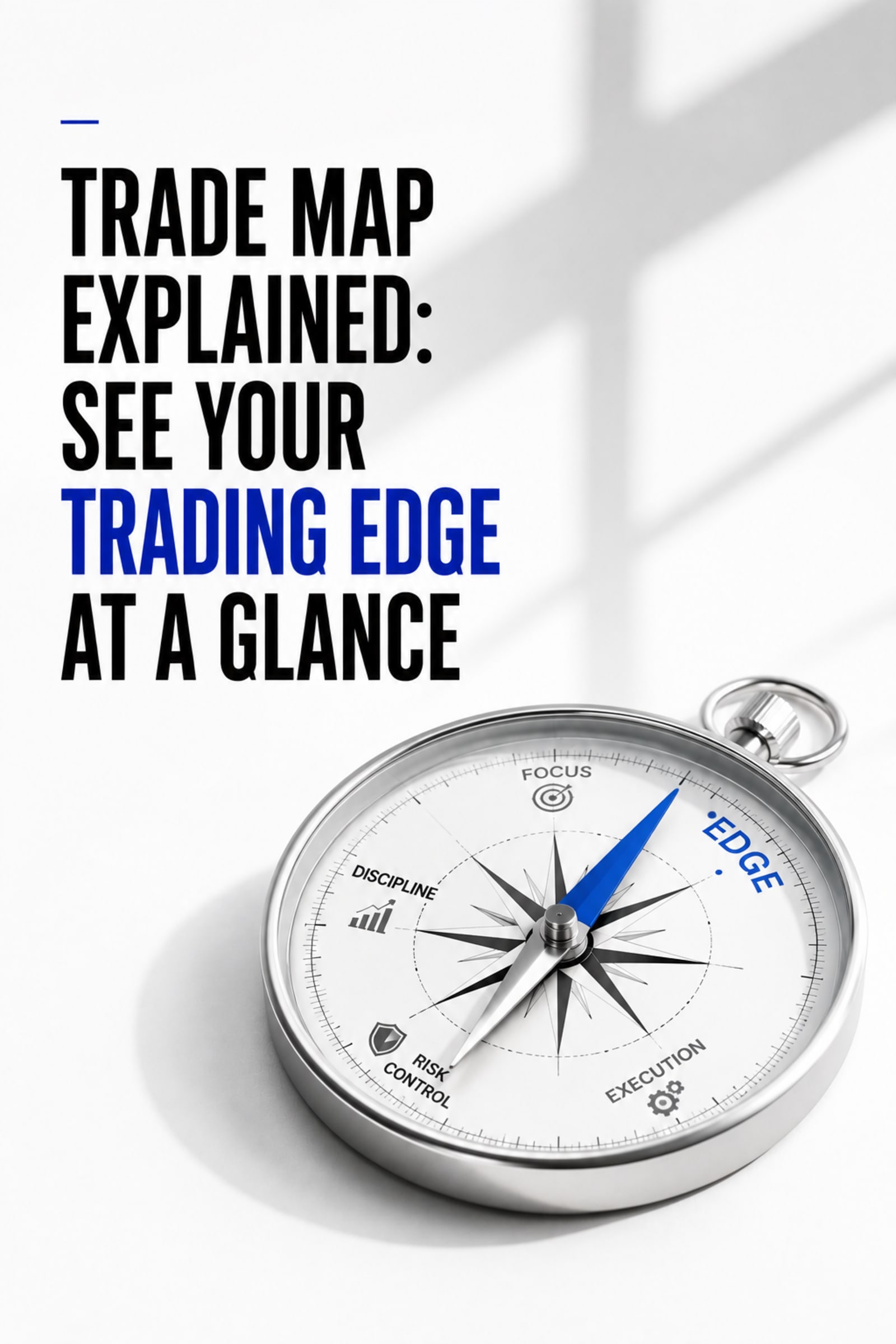
The Trade Map is a PropScholar dashboard feature that visualises your trading performance so you can spot your real edge — and your real weaknesses — without digging through spreadsheets. Here's exactly what it shows, how to read it, and why it matters for passing your evaluation.
Start your evaluationTrade Map Explained: See Your Trading Edge at a Glance
TL;DR: PropScholar's Trade Map turns your raw trade history into a clear visual snapshot of where you actually make money — and where you're quietly bleeding it.
Key takeaways:
- The Trade Map is a built-in PropScholar dashboard tool that aggregates your evaluation trades into readable performance patterns.
- It surfaces metrics like your best trading sessions, win-rate by instrument, and how your risk-reward ratios play out in practice.
- You don't need a separate spreadsheet or external journal — it's all inside your PropScholar account.
- Reading it correctly can be the difference between repeating the same mistakes across challenges and fixing them once.
- It works alongside Scholaris AI, PropScholar's AI assistant, which can help you interpret what the data is actually telling you.
Most traders know, roughly, what they're doing wrong. They trade too big after a loss. They close winners early and hold losers too long. They know it — and they do it anyway, because they can't actually see the pattern in real time. It stays vague, a feeling.
That's the problem the Trade Map is built to solve. It makes your tendencies visible. Not in a 200-row spreadsheet you have to build yourself, but in a single screen you can read in about thirty seconds.
If you're working through a PropScholar evaluation — or thinking about starting one — understanding this feature is worth your time before you place a single trade.
What Is the Trade Map, Exactly?
The Trade Map is a performance analytics view inside your PropScholar dashboard. It takes every trade you've placed during your evaluation and organises it into visual data — not just a list of wins and losses, but patterns across time, instrument, session, and trade structure.
Think of it as your trading x-ray. It doesn't tell you what to trade. It shows you what you're actually doing, stripped of the story you tell yourself about your session.
The distinction matters. A trader who thinks they're profitable on gold but is actually losing money on every gold trade after 3 PM London time will keep attributing losses to bad luck. The Trade Map shows them the time-of-day breakdown. Now it's not bad luck — it's a fixable pattern.
What the Trade Map Actually Shows You
Your Win Rate — Split Out, Not Averaged
A single overall win rate number is nearly useless on its own. Fifty percent win rate with a 3:1 risk-reward ratio is a great strategy. Fifty percent win rate with a 0.8:1 ratio is a slow bleed.
The Trade Map doesn't just give you one number. It shows win rate broken down by instrument and by session — so you can see whether your 60% win rate on EUR/USD disappears completely when you switch to indices, or whether you're actually profitable in the London session and just giving it all back in New York.
This is the kind of data that used to require a paid analytics subscription or hours in Google Sheets. Here it's already calculated, already displayed.
Risk-Reward Ratios in Practice
Here's something most beginners don't check: the difference between the risk-reward ratio they plan and the one they actually execute.
You might plan a 1:2 setup — risk 50 pips, target 100 pips. But then the trade moves in your favour and you close it at 60 pips because you're nervous. Now your real ratio is 1:1.2. Do that enough times and your strategy, which was profitable on paper, becomes breakeven or worse in practice.
The Trade Map calculates your actual average risk-reward across all your closed trades. If there's a gap between your planned and actual ratios, you'll see it here. That gap is almost always behavioural — patience, fear, revenge trading. Naming it is the first step to fixing it.
Session and Time-of-Day Performance
The market behaves differently at different times. London open volatility, the New York session overlap, the Asian session drift — these aren't just concepts from a YouTube video, they affect your trade outcomes in very real, measurable ways.
The Trade Map maps your results against the sessions you traded in. If you're consistently profitable in one window and losing in another, that's immediately actionable information. You can simply stop trading the sessions where your edge doesn't exist yet.
Some of the most effective PropScholar evaluation passes we've seen come from traders who looked at their Trade Map, noticed they were profitable in a two-hour window, and just traded that window exclusively for the rest of the challenge. That's not cheating — that's self-awareness.
Drawdown Patterns
This one is less celebrated but arguably the most important for evaluation purposes. PropScholar evaluations have daily and overall drawdown limits, just like any serious evaluation structure. The Trade Map shows you how your drawdown accumulates — whether it spikes suddenly in a single bad trade or erodes gradually across a losing streak.
A trader with sudden-spike drawdown has a position-sizing problem. A trader with slow-erosion drawdown has a "letting losers run" problem. Two different diagnoses, two different fixes.
Without this view, both traders just see the same number: "I lost 3% today." With it, the cause is obvious.
How to Read Your Trade Map Without Overthinking It
When you open the Trade Map for the first time, resist the urge to analyse everything at once. Start with three questions in order.
First: where am I actually making money? Find the instrument and session where your win rate and risk-reward are both positive. That's your real edge. It might be smaller than you thought — one pair, one two-hour window — and that's fine. A small, real edge beats a large, imaginary one.
Second: where am I losing money that I didn't realise? Look for instruments or sessions with negative expected value. If you see that you've placed fifteen trades on a particular asset and lost on twelve of them, you don't have an edge there. The Trade Map makes that undeniable.
Third: is my risk-reward in practice matching my plan? If not, your execution is undermining a potentially solid strategy. That's fixable — and knowing it's the problem means you don't waste another evaluation trying to find a "better" strategy when the one you have just needs cleaner execution.
That's it. Three questions, one screen, thirty seconds. Then you adjust and keep going.
How the Trade Map Works Alongside Scholaris AI
The Trade Map gives you the data. Scholaris AI, PropScholar's built-in AI trading assistant, helps you interpret what to do with it.
If you pull up your Trade Map and see a pattern you're not sure how to act on — say, your win rate drops sharply on Fridays but you don't know if that's session-specific or news-driven — you can ask Scholaris directly. It reads your evaluation context and gives you an answer that's specific to your situation, not a generic response.
The two tools are designed to work together. Data from the Trade Map becomes the input for a Scholaris conversation, and that conversation turns into an adjustment you can test in the next session. You can read more about how that AI layer works in our detailed breakdown: AI-Powered Trading Evaluation: How Scholaris AI Helps You Pass.
Why This Matters More During an Evaluation Than in Live Trading
In regular trading, bad habits accumulate slowly. You might not notice them for months. In a funded evaluation, you have a defined window and defined limits. Every bad habit becomes expensive faster.
The Trade Map compresses the feedback loop. Instead of needing three months of trading data to spot a pattern, you can see it in your first ten to fifteen evaluation trades. That's enough data to tell you whether you should continue with your current approach or adjust something specific before you breach a drawdown limit.
This is why traders who actively use the Trade Map tend to get more from their evaluations — not because the tool is magic, but because information you actually see is information you can act on. Information buried in your memory is information you'll ignore when the market is moving fast and emotions are high.
Who Benefits Most From the Trade Map
Honestly, every trader benefits — but the impact is highest for two groups.
Beginners who are still forming their strategy get a shortcut to the self-knowledge that usually takes years of journaling to develop. Instead of building a spreadsheet habit from scratch, they get structured feedback immediately.
Experienced traders returning from a losing streak get something different: proof. It's easy to blame the market. The Trade Map either confirms that the market conditions were genuinely unusual, or it shows you that you deviated from your own rules. Both are valuable — but the second one is harder to accept without clear evidence.
PropScholar's evaluation entry starts at $5 (around Rs. 400 for Indian traders), which means even a new trader can run through a full evaluation, study their Trade Map thoroughly, and use what they learn on the next attempt without a significant financial cost. That's a meaningful difference from larger platforms where a single challenge fee can be $150 or more.
Making the Trade Map Part of Your Routine
The traders who get the most from this feature aren't checking it once at the end of a challenge. They check it every few sessions. After a losing run, before sizing up. When they're considering adding a new instrument.
Treat it like a mirror, not a judge. It's not there to tell you you're a bad trader. It's there to show you exactly what kind of trader you are right now — which is the starting point for becoming the kind of trader you want to be.
If you have questions about reading your Trade Map or want to discuss your patterns with other traders, the PropScholar Discord community has over 3,000 members doing exactly that. Or reach out directly at business@propscholar.com.
PropScholar is a scholarship-based trading evaluation platform operated by a Private Limited company registered in India. We are not a prop firm and do not manage or allocate institutional capital. Our model rewards proven trading skill with scholarship grants upon successful evaluation completion.
Related reading
- Pay After Pass Prop Firms: The Hidden Scam Draining Traders in 2025 (And the Safer Alternative)
- Why $1 "Pay-After-Pass" Prop Firm Challenges Are a Trap (2026 Guide)
- Hidden Trading Rules That Kill Accounts (And How to Avoid Them)
- Profit Targets in Evaluations: How to Plan Trades to Hit Them
- AI-Powered Trading Evaluation: How Scholaris AI Helps You Pass
- What Does a $1 Prop Firm Account Actually Get You?
Ready to Prove Your Edge?
Join 500+ traders. Start from just $5. Get funded within days.
Frequently Asked Questions
The Trade Map is a performance analytics feature inside the PropScholar dashboard. It takes your evaluation trades and displays them as visual data — win rates by instrument and session, actual risk-reward ratios, drawdown patterns, and your best trading windows. It's designed to show you your real trading edge without requiring an external journal or spreadsheet.
More From PropScholar

Trading Education
Giveaways vs Trading Scholarships: How PropScholar Is Changing the Game for Traders
8 min read

Trading Education
How PropScholar Bridges the Gap Between Traders and Top Tier Prop Firms
7 min read
Trading Education
Why Capital Matters Not Just Tradable Capital but Affordable Capital
7 min read